In need of new distinctive brand visual
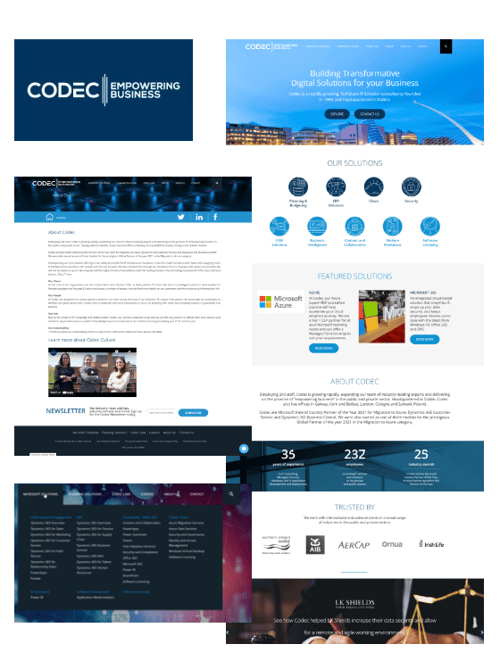
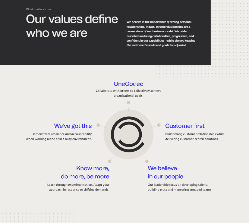
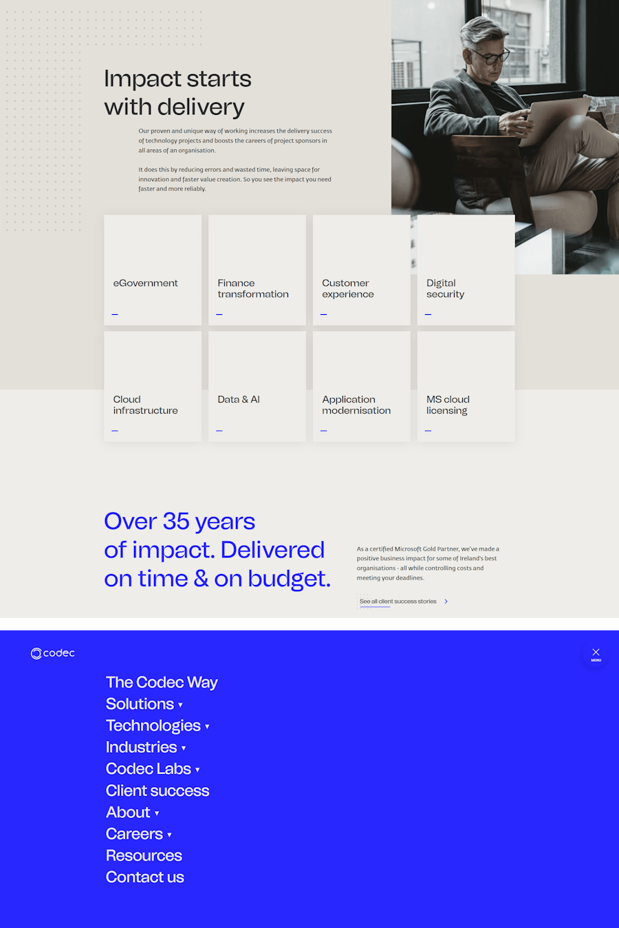
Inspired by the new positioning and its core pillars, we embarked on the visual transformation of the Codec brand that would bring the new brand promise to life.
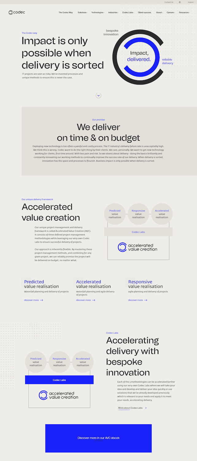
When it came to building out the elements of the brand visual language, we decided, just as Codec does, to challenge the IT industry norms. Unlike the majority of IT / MSP brands that tend to look the same with the all too predictable blue colour palettes, stock photography and visual cliches of data points, we took a different approach.
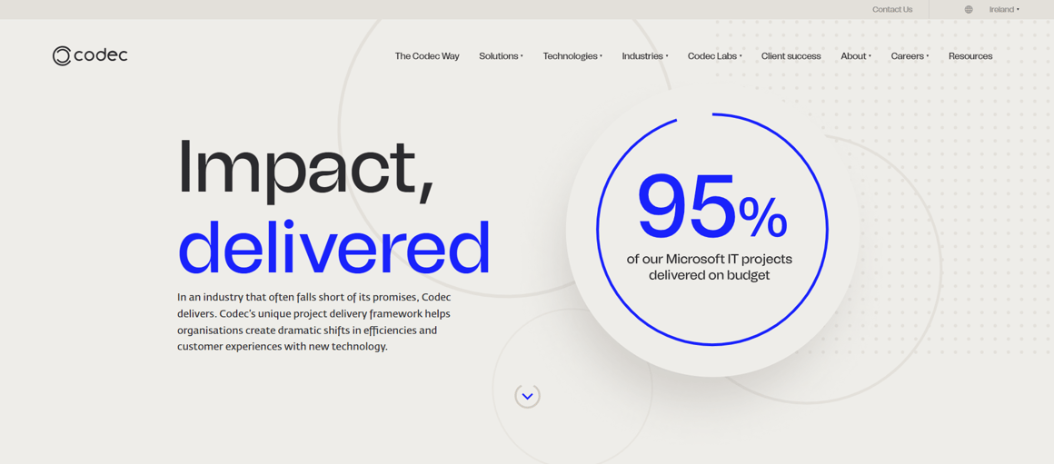
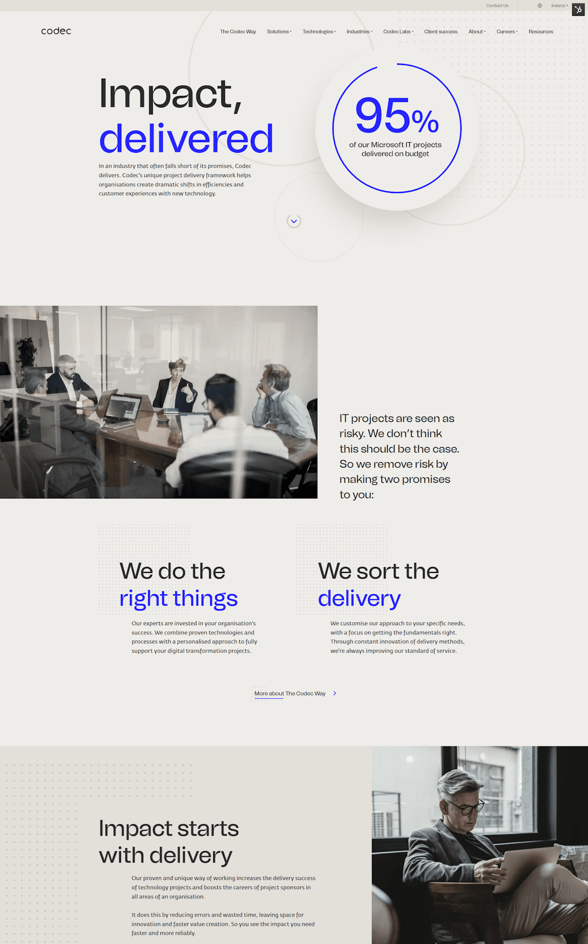
The new visual ID is inspired by the branding of architecture and design studios, which serves as a metaphor for software building as a creative act. The overall look is minimalistic and clean, easy to read and understand.
New logo
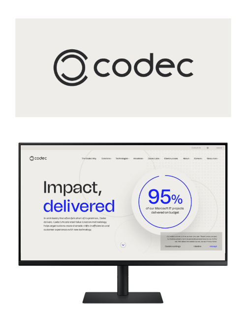
In line with this caregiver brand archetype, we played with the two letters C from the beginning and the end of Codec’s name to create a new brandmark symbolising a safe pair of hands and the collaborative nature of Codec’s relationships with clients.


Colour palette & textures
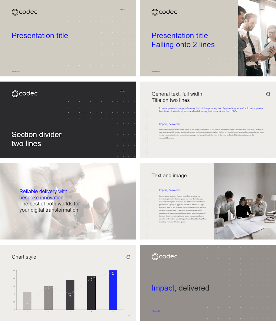
We designed a warm colour scheme of natural tones of the grey to sandy brown colour palette. Ideally these primary greys and browns are used in their more textured forms, resembling elements found in nature or real life environments, like stones or building materials. To give a nod to the Codec’s industry's typical colour and to the strong link to Microsoft, we decided to offset it with blue. However, not your average IT blue. Codec's blue is inspired by visual artist Yves Klein and his famous and beautiful blue.

Brand visual ID
In general, the brand visual language was designed around the following pillars:
1/ white space & desaturated look & feel
2/ dotted patterns
3/ contrasting typography
4/ imagery (and its lack of)
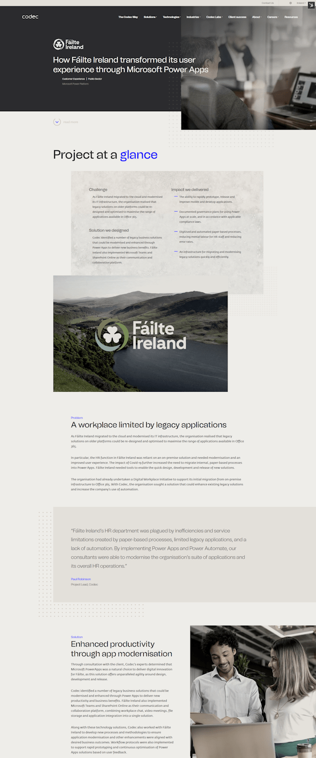
The design layouts are based on a sufficient amount of 'white space' interacting with subtle dotted background textures representing Codec's attention to detail. An intentional desaturated look and feel allows for typography to stand out. Sophisticated typography work is a core brand feature. The imagery choice makes Codec different. Use of imagery is intentionally limited. Stock photography is to be avoided, if possible, and tailor-made high production value photographs are preferred. Their job is to add a stylish human element to the brand - to help position Codec as approachable experts.

Brand guidelines & full suite of branded company assets
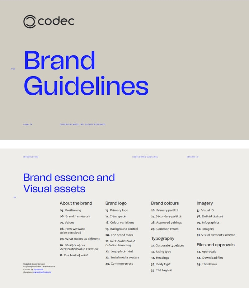
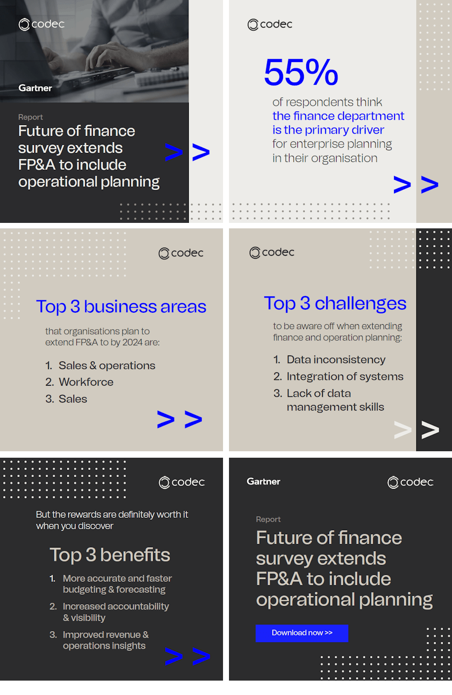
We have developed a brand book which includes details about the new brand and its desired aesthetic anybody working with the brand should be looking to achieve. To help roll out this new brand we have designed a suite of branded assets for internal and external use by the Codec team, including:
- Stationery and email signatures
- PowerPoint and Word template
- Social media templates
- Case study templates
- Marketing email templates

